
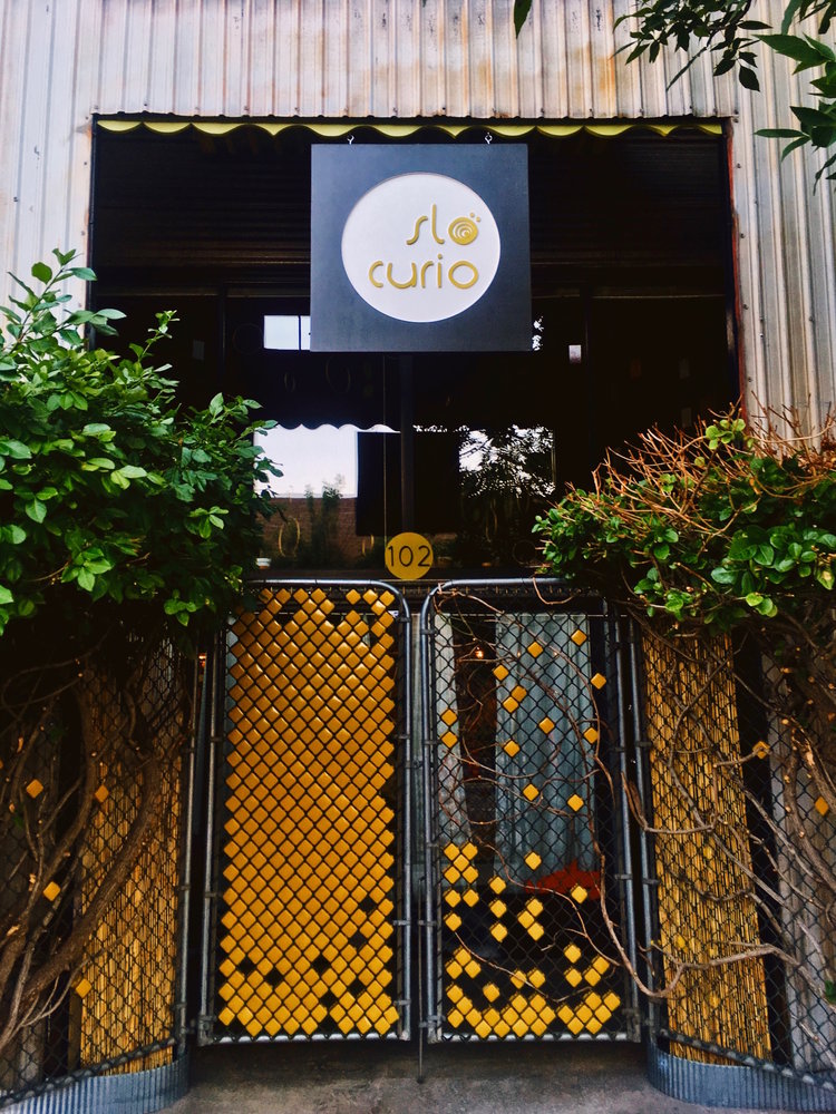
SLO CURIO
— 2018
UX & UI Design: Erin Jacobson
Creative & Art Direction: Erin Jacobson
CMS: Squarespace
Tools: Sketch, Invision, Zeplin
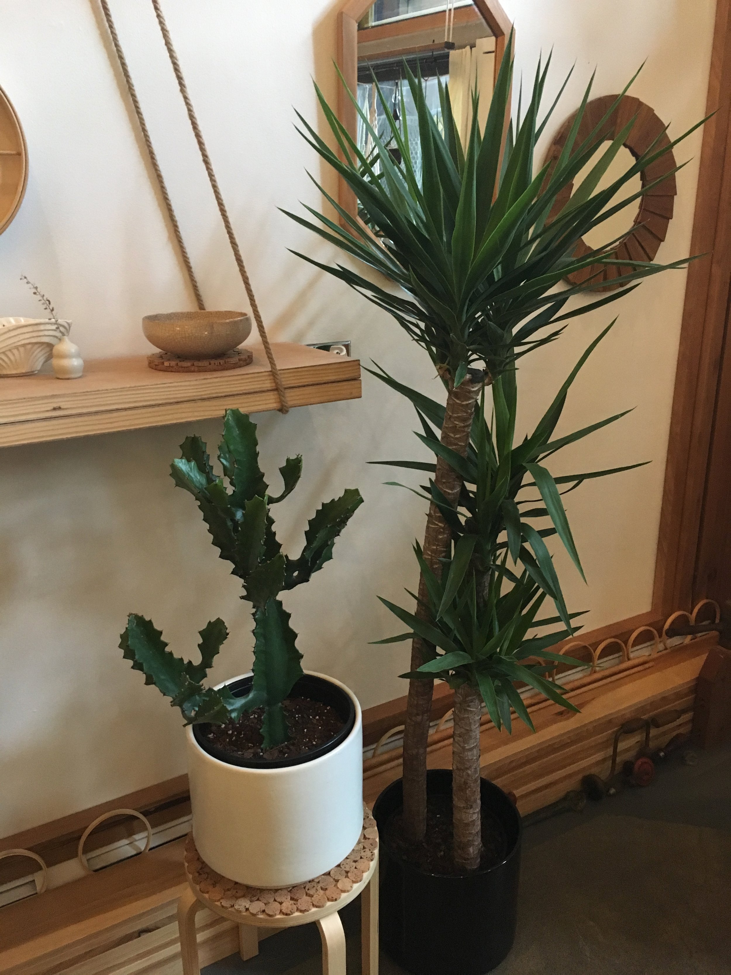
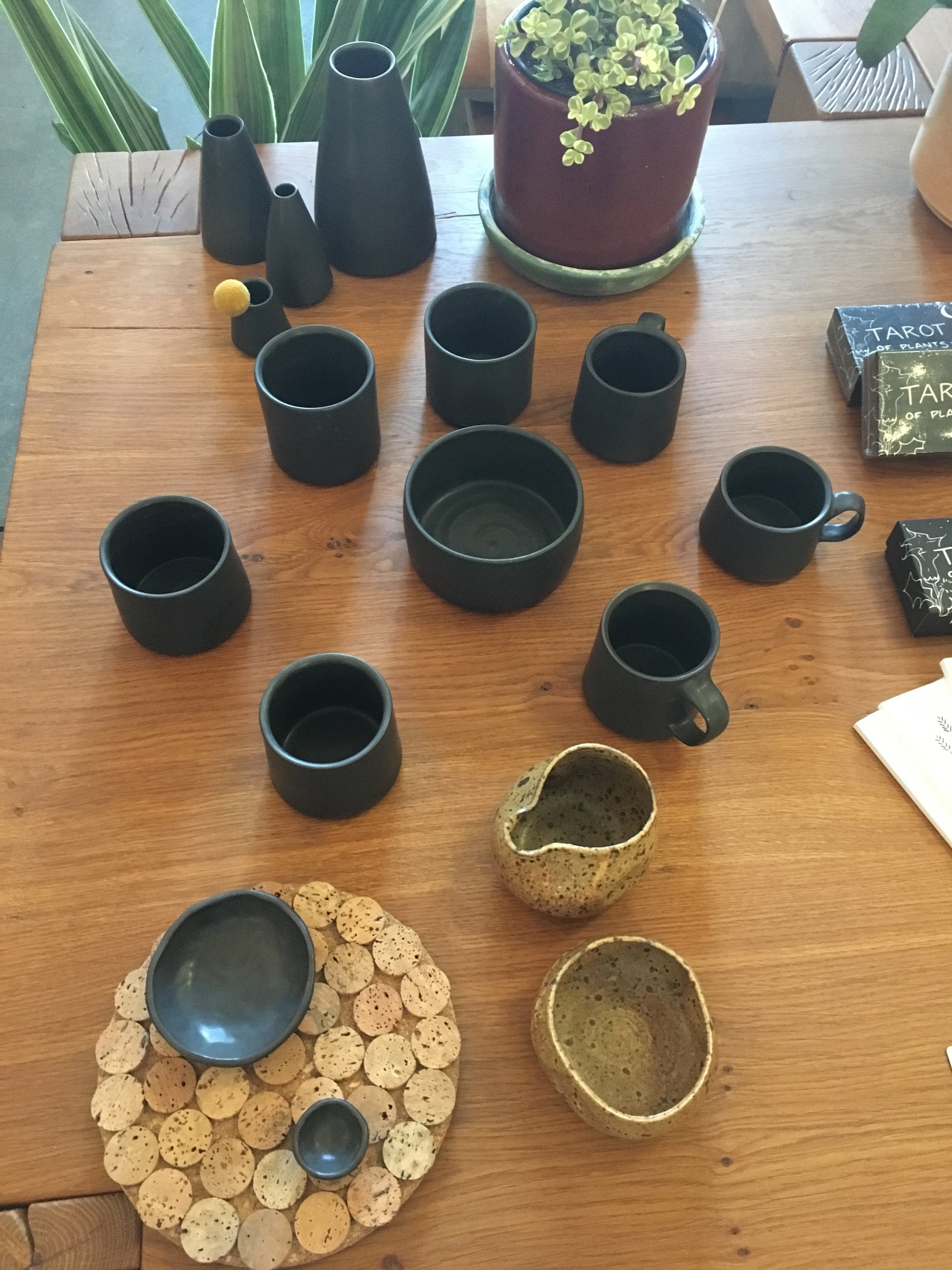
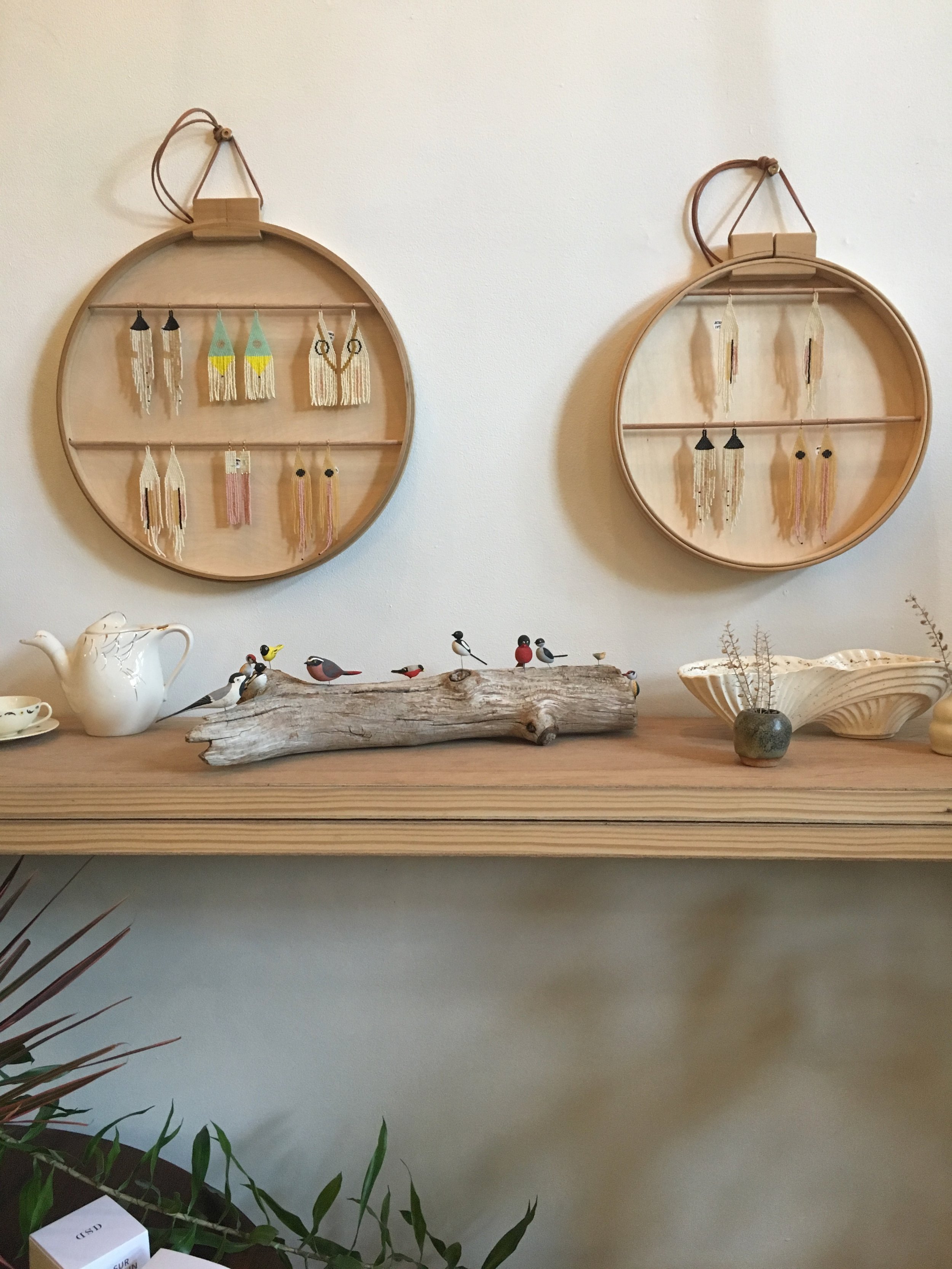
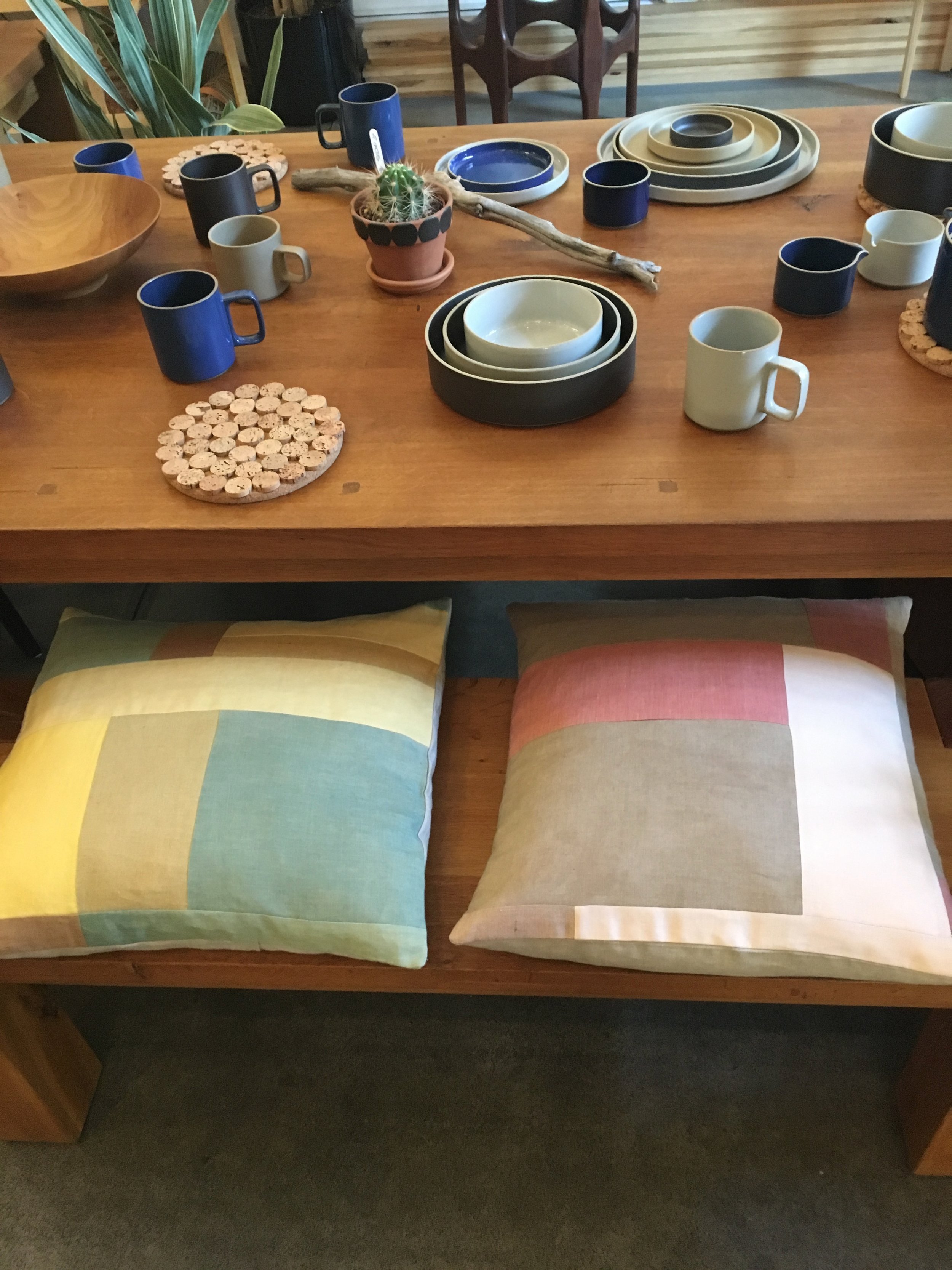
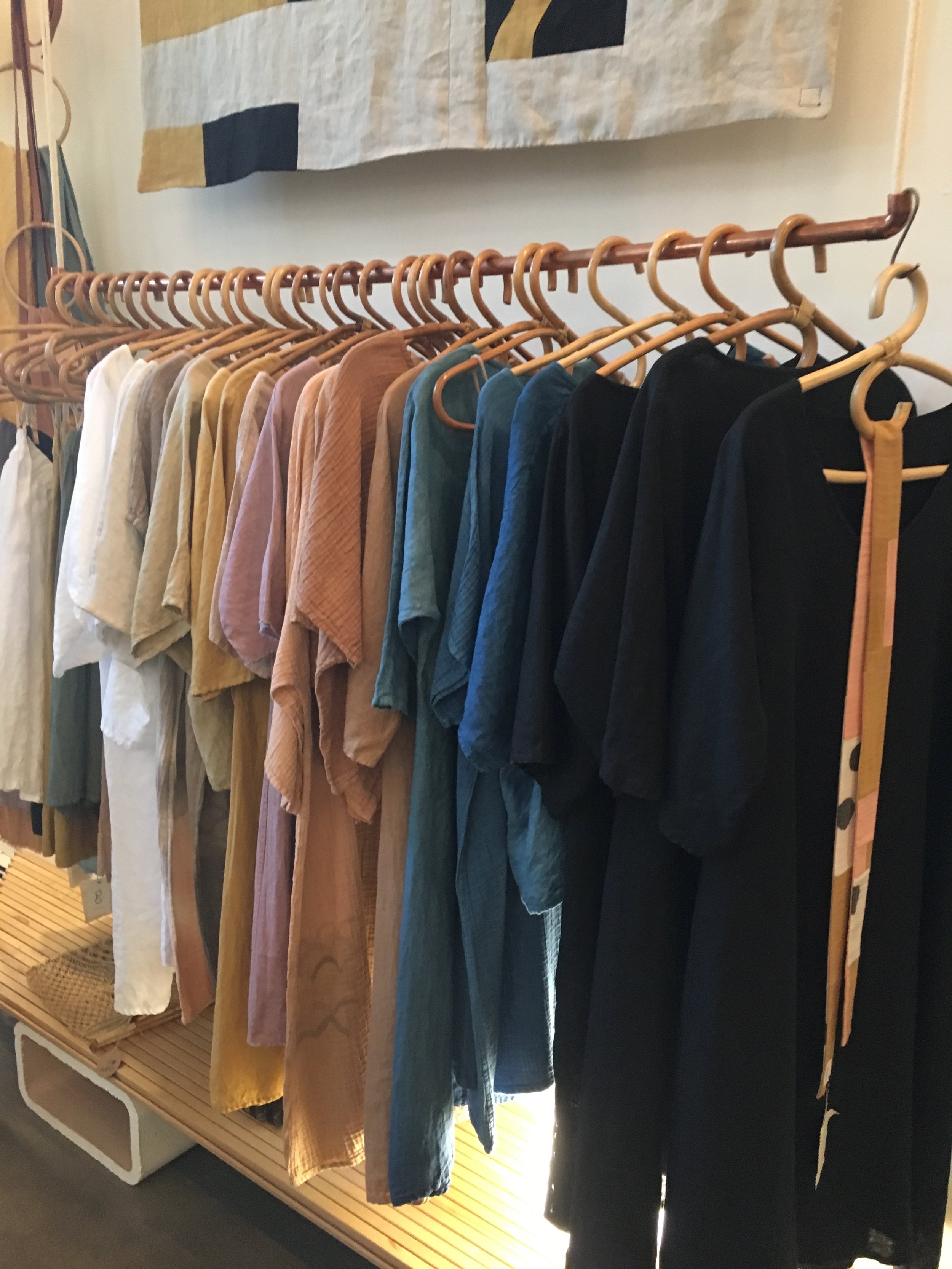
Nestled into the edge of Denver’s RINO art district sits Slo Curio, a ‘luxury eco-boutique’ founded by designers and entrepreneurs, Ry and G Roslie. The pair describe themselves as a nomadic design team, having lived in numerous West Coast locations and most recently landing in Denver’s up and coming artist district during the spring of 2018. Their designs have evolved over the years but their core tenants have always remained - Ry and G are dedicated to the slow maker movement - a pursuit that values craft and sustainable manufacturing practices over speed. In addition to their own wares, Ry and G also feature fellow artists’ goods, always striving to curate a shop that helps boost the local maker community. The couple has long succeed on word of mouth but as they work to expand their presence, they realized the need for an e-commerce solution that will allow them to reach a larger audience while also advocating for their fellow artists and the slow maker movement.
SLO CURIO 1.0
Recognizing the need for an online presence, G Roslie began building a Squarespace site in the spring of 2018, hoping to promote it in conjunction with the opening of their new RINO location. When I met with Ry & G a few months later to learn more about their shop and review the existing site, I noticed a few key challenges.
CHALLENGE #1
- The shop features a diverse product set but doesn’t carry a large quantity of any one item. The existing site didn’t accurately reflect the variety of products available and the navigation structure was too focused on non-critical items.
CHALLENGE
#2
- The existing site didn’t facilitate efficient browsing. It lacked some common browsing conventions and required users to scan through significant pictures or text to find key elements.
CHALLENGE
#3
-the product page lacks information hierarchy resulting in a dense body of text, making it hard to scan for critical information.
DESIGNING FOR SLO CURIO’S CUSTOMERS
During our interview, Ry & G mentioned that they were still trying to find their exact customer base within the Denver market. They had noticed a trend of new Denver transplants visiting their shop but were working to understand other possible shoppers. Interviews with potential customers revealed two additional customer types.

Michelle, 33 - Interior Designer
— “ I struggle because I’m often juggling multiple clients at once and don’t have time to visit local shops with them in person to review every item. ”
Michelle needs an efficient way to review and purchase items for clients when she can’t get to the brick and mortar shop.

Chloe, 26 - Fabric Store Clerk & textile designer
“ I like shops like Etsy where I can purchase handmade gifts for friends or family but I often forget to place an order until last minute and some makers have 2-3 week lead times. I know I can always turn to local shops like Slo Curio but they have limited hours that don’t always match with my busy schedule.”
Chloe is often ordering last minute and needs an alternate method of browsing and ordering because she often can’t make it to the shop during the limited day-time shop hours.
DEFINING SLO CURIO 2.0
Based on initial user testing and customer research, three key goals were outlined for the next iteration of Slo Curio.
Chloe’s user flow is representative of a typical user, requiring quick and efficient browsing.
#1
-Provide structure and simplicity to Slo Curio’s wide product selection to find products easily.
#2
- Allow for easy browsing and product selection by shifting the focus from an ‘about us’ site to a true ‘e-commerce’ site.
#3
Integrate shopping support elements like a wishlist to help frequent customers like Michelle review and plan for future purchases.
The wishlist page was viewed as a helpful element for those completing tasks under the power-user persona, Michelle. Testing however, showed some flaws with the system.
BRINGING SLO CURIO TO LIFE
The existing Slo Curio site was reserved and classic, using a simple palette of black and white to portray the modern style of the shop. When visiting the shop in person, however, I realized the shop was alive with color from G’s natural dyes and playful organic shapes could be seen throughout much of their designs.

#4F4E4D

#F5EDEA

#415668
Wanting to keep things simple, I used an image of G’s dye’s to create a color palette that would complement the existing black and white.
NEXT STEPS
Ry and G have big dreams for Slo Curio that extend beyond retail. As they continue their work of bolstering the local artist community, they would like to start offering Slo Curio community engagement events like workshops and Artist in Residence speaking events. The next phase of the website would include elements to support these features, like online booking for workshops and applications to become an artist in residence.
In the interim, I would continue testing the use-ability and performance of key features of the new retail site including the featured artist and wishlist pages.